
ArchivesAuthor: Jaka Šuln
08DecKatka, december 2017
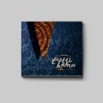
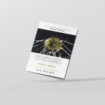
22MajTretji Kanu
Fresh out the press, CD album design + photography for Tretji Kanu, a new band from Novo mesto.
![]()
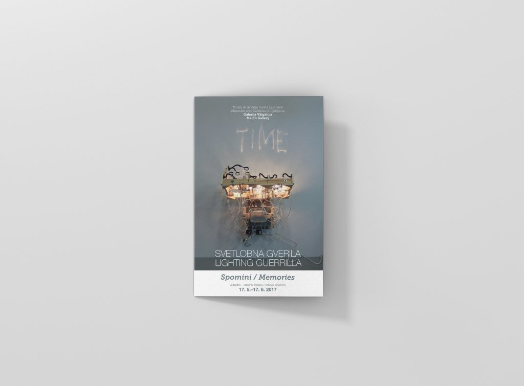
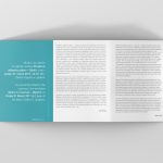
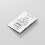
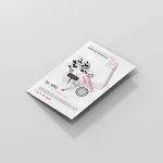
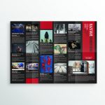
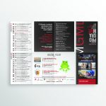
04MajBrochure design for Galerija Vžigalica / Match Gallery
I finally found the time to gather all the brochure designs and make these mockups for the work I did for the Match Gallery (Galerija Vžigalica) in Ljubljana.
These are various brochure designs (bi-fold brochures sent by post) I did in the past year or so for exhibitions . The work usually consists of the brochure and poster design + banners, etc.
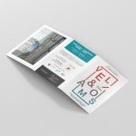
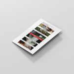

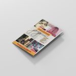
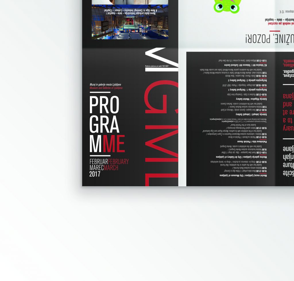
16MarMGML zloženka / brochure
Fresh brochure design I did for MGML – Museum and Galleries of Ljubljana. It comes out once every two months and features all of the events happening between the museums and galleries. Format is 300x350mm and folds 4 by 2 into a nice handy pocket planner.
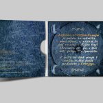
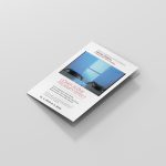
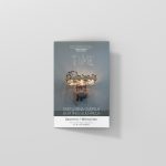
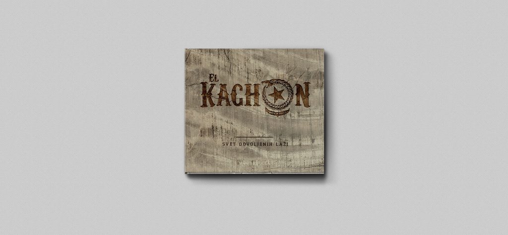
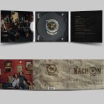
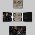
16FebEl Kachon – CD album design
Second CD album design for the group El Kachon – Svet dovoljenih laži. 6 sided eco digipak + booklet. Design & photography Jaka Šuln.
Druga plošča za novomeško skupino El Kachon – Svet dovoljenih laži. 6-stranski eko digipak + knjižica z besedili; oblikovanje in fotografija Jaka Šuln.
17OktNew logo – FORTFLY
Not so recent logo work for a company called FORTFLY, a soon-to-be platform for connecting freelancers with companies, providing know-how. ![]()

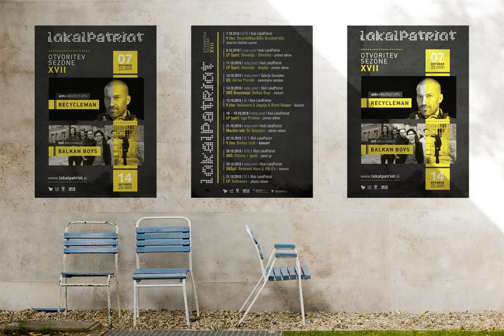
05OktSeason opening
Fresh season opening poster design for the club LokalPatriot in Novo mesto / Slovenia.
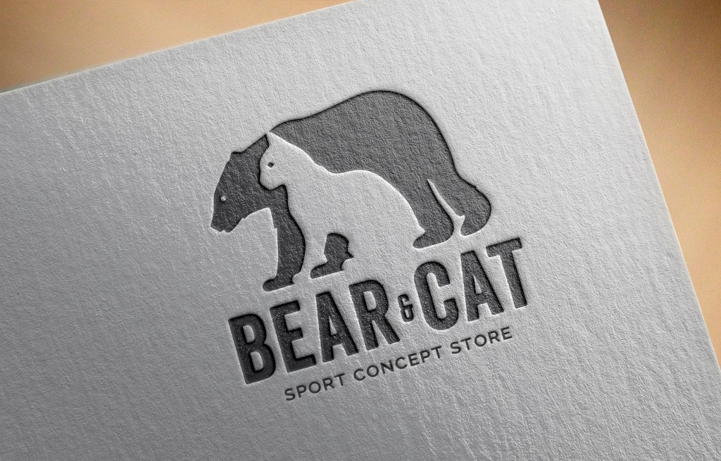
04AprBear & Cat logotip
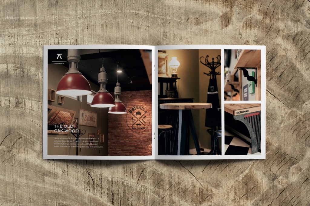
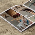
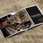
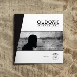
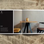
04MarOLDOAK furniture // Barber Room by Edis interior shoot
Last week I did a last minute interior shoot project for Artisan Studio who designed the brochure for the client Drugačno pohištvo // OLDOAK furniture from Ljubljana that did this amazing work in the Barber Room (by Edis) in Novo mesto, Slovenia. All custom made from recycled oak wood, take a look at their website!
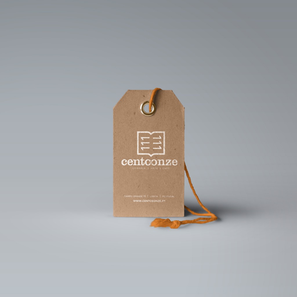
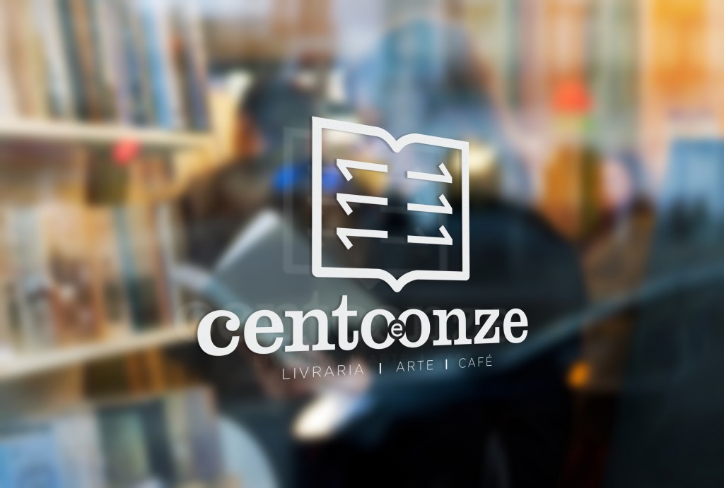
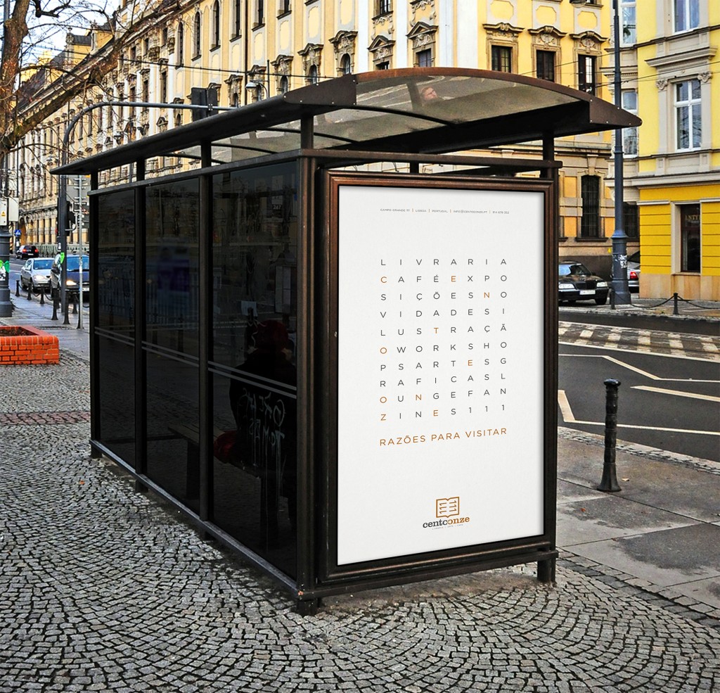
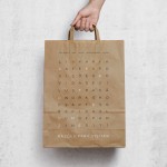
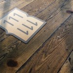
24FebBookshop Visual Identity Proposal in Lisbon
One of my last projects I did in Lisbon – a visual identity proposal for a bookshop that changed the owner recently. The bookshops previous name was “Campo Grande 111” which is also the actual address. I decided to keep a part of it in the new visual identity – the new name is “Cento e Onze” which in translation means “111”.
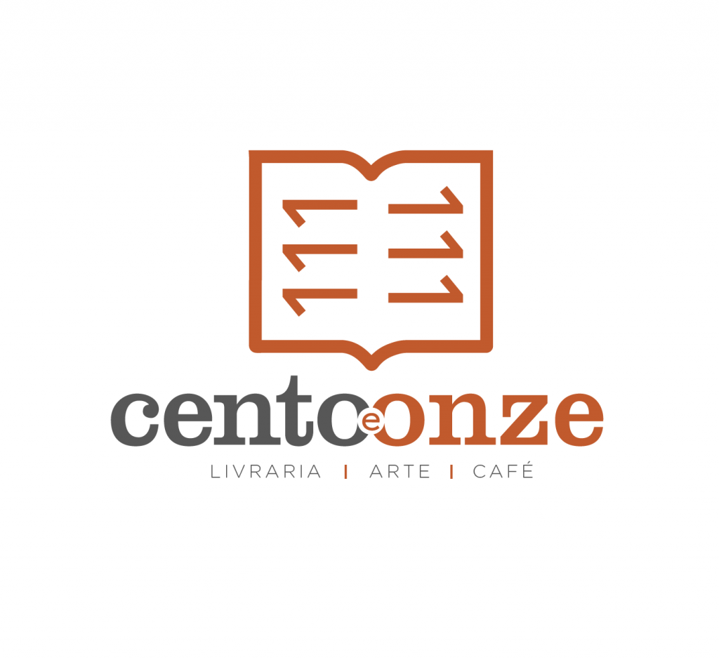
The bookshop wants to open up a gallery space, a place for workshops and a small cafe inside. I wanted to keep it warm, playful and yet professional and overall applicable in all variations to all surfaces.
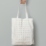
The open book lines also read “111” in positive and negative which makes up for a nice detail. I also made a creative advert / slogan to go with it, which reads “111 reasons to visit” that can be used on shopping or tote bags or it can be used as a citylight poster.